Excess Deaths in England and Wales
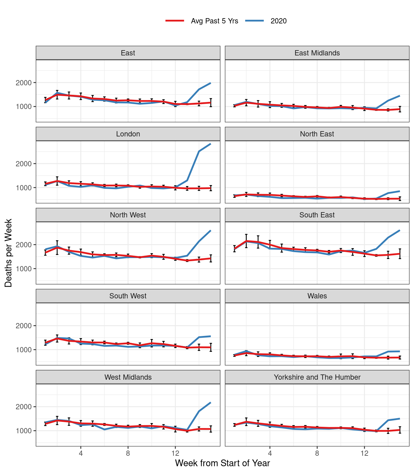
Figure 1: Total Weekly Deaths in England & Wales.
The red curve is an equally-weighted average of weekly deaths in a given region for the past five years, up to and including 2019. Weeks are defined by the ONS to end on Fridays. This means that a given week does not necessarily correspond to the same days of the year across years, but always exactly one of each day of the week: Monday, Tuesday, etc. This eliminates seasonality from day-of-the-week effects, but creates the possibility of neglected seasonality from holidays that move across weeks during different years, e.g. Easter. For each point on the red curve, we have added simple error bars: \(\pm 2 \times \text{SE}\) where SE is the usual standard error for a mean, ignoring any possible dependence between deaths in the same week across different years. The blue curve depicts weekly deaths in 2020. From week 12 or 13, depending on region, we see a dramatic uptick in deaths across England and Wales, well outside the two standard error bars. R source code for this plot follows below.
library(tidyverse)
library(rcovidUK)

#Set the most recent week of data for 2020
week_2020 <- 16 # original version of this post only had data up to week 16
#week_2020 <- ONSweekly %>%
#  filter(year == 2020, !is.na(deaths)) %>%
#  pull(week) %>%
#  max

df_2020 <- ONSweekly %>%
  filter(year == 2020)

df_prev5 <- ONSweekly %>%
  filter(year < 2020 & year >= 2015)

df_prev5 %>%
  group_by(reg_nm, week) %>%
  summarise(deaths_mean = mean(deaths),
            deaths_sd = sd(deaths),
            n = n(),
            se = deaths_sd/sqrt(n)) %>%
  mutate(year = "2015-2019") %>%
  rename(deaths = deaths_mean) %>%
  bind_rows(df_2020) %>%
  filter(week<week_2020) %>%
  ggplot(aes(x=week, y = deaths, col = year,
             group = reg_id)) +
  geom_errorbar(aes(ymin=deaths - 2 * se,
                    ymax = deaths + 2 * se),
                width=.2, colour="black") +
  geom_line(size = 1) +
  facet_wrap(~reg_nm, ncol = 2) +
  scale_color_brewer(palette = "Set1",
                     labels = c("Avg Past 5 Yrs", "2020")) +
  labs(x= "Week from Start of Year",
       y = "Deaths per Week") +
  theme_bw()+
  theme(legend.position = 'top',
        legend.title = element_blank(),
        legend.key.size = unit(1, "cm"))