UK Excess Deaths by Age Group and Sex
In an earlier post I looked at regional differences in the effects of Covid-19 by calculating excess deaths in each week of 2020 relative to an average of the preceding five years. There the idea was to get a sense for the number of deaths that were likely caused by Covid-19 regardless of whether they were officially registered as such, e.g. deaths that occurred outside of hospitals. Thanks to my RA Dan Mead, here’s the same analysis carried out by age group and sex rather than region:
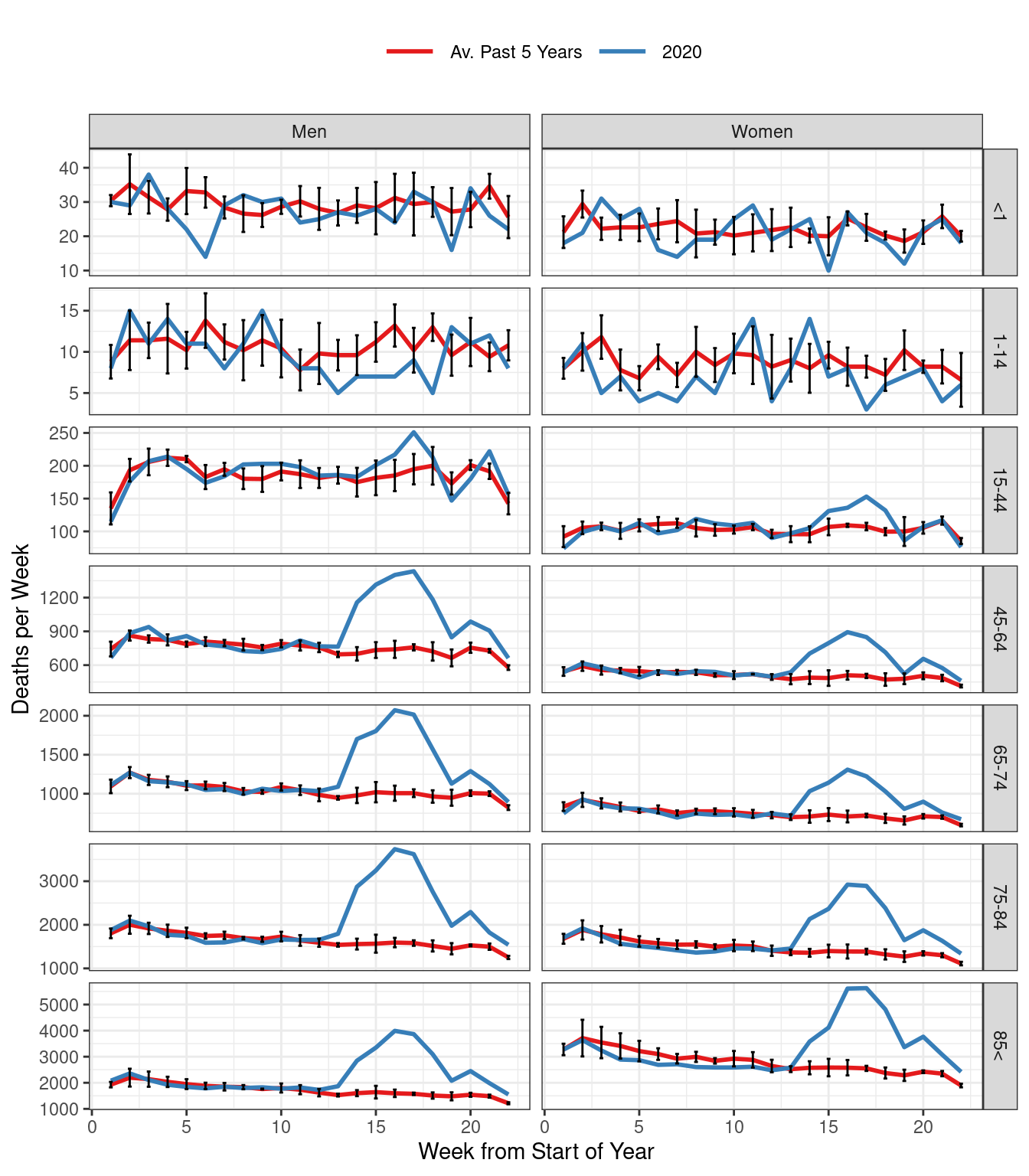
Figure 1: Total Weekly Deaths in England & Wales by Sex and Age Group.
The red curve is an equally-weighted average of reported weekly deaths for the past five years up to and including 2019, while the blue curve depicts weekly deaths in 2020. All calculations are based on data from the ONS. Each point on the red curve is accompanied by error bars indicating plus/minus two standard errors of the mean. Roughly speaking these bounds are equivalent to the margin of error from a typical opinion poll. (For the precise calculations, see the R code below.)
Deaths below age 1 show no clear pattern in 2020 relative to the average of past years. There’s a hint of slightly lower deaths among males aged 1-14 since the lockdown began, although the data are quite noisy given the extremely small number of deaths in this age group. For the remaining age groups, we start to see a clear effect around the time of the covid outbreak, approximately weeks 11 through 22 of 2020. Because death rates vary with age and sex in both ordinary years and 2020, the cleanest way to compare across groups is by computing relative excess deaths. To do this, we add up the differences between the red curve and the blue curve between weeks 11 and 22 and divide the result by sum of the red curve during the same period of time. The result give us the percentage by which total deaths in a given age/sex group in weeks 11 through 22 of 2020 exceed the “usual” number of deaths for this age/sex group during the same weeks based on past data.
In the 15-44 age group, male deaths during weeks 11 through 22 of 2020 were 6.4% higher than usual. In contrast, female deaths were 9.7% higher than usual. Deaths in this age group, however, are relatively rare. Accordingly, the blue curves lie comfortably within the error bars for all but a small number of weeks. For the remaining age groups, the picture becomes much starker and the relative excess deaths much larger:
| Age Group | Men | Women |
|---|---|---|
| 45-64 | +42.2% | +32.4% |
| 65-74 | +42.9% | +31.6% |
| 75-84 | +58.2% | +45.5% |
| Over 85 | +65.3% | +48.5% |
In each age group, relative excess deaths are substantially higher for men than women. For example, male deaths in the 45-64 age group were 42.2% higher than usual in weeks 11 through 22 of 2020 compared to 32.4% higher for women. Although relative excess deaths increase markedly with age for both sexes, even the rates in the 45-64 group are alarming, particularly for men.
You can replicate the plot from above by running this R code:
library(tidyverse)
library(rcovidUK)

#Set the most recent week of data for 2020
week_2020 <- ONSweeklyagegender %>%
  filter(year == 2020, age == "<1", !is.na(deaths)) %>%
  pull(week) %>%
  max

df_2020 <- ONSweeklyagegender %>%
  filter(year == 2020)

df_prev5 <- ONSweeklyagegender %>%
  filter(year < 2020 & year >= 2015) # Use last 5 years for average


df_prev5 %>%
  group_by(age, week, gender) %>%
  summarise(deaths_mean = mean(deaths),
            deaths_sd = sd(deaths),
            n = n(),
            se = deaths_sd/sqrt(n)) %>%
  ungroup() %>%
  mutate(year = "2015-2019") %>%
  rename(deaths = deaths_mean) %>%
  bind_rows(df_2020) %>%
  filter(week <= week_2020) %>%
  ggplot(aes(x=week, y = deaths, col =year)) +
  geom_line(size = 1) +
  geom_errorbar(aes(ymin=deaths - 2 * se, ymax=deaths + 2 * se), width=.2, colour="black")+
  facet_grid(vars(age), vars(gender), scale="free") +
  scale_color_brewer(palette = "Set1",
                     labels = c("Av. Past 5 Years", "2020")) +
  labs(x= "Week from Start of Year",
       y = "Deaths per Week") +
  theme_bw()+
  theme(legend.position = 'top',
        legend.title = element_blank(),
        legend.key.size = unit(1, "cm"))