Past the Peak? Excess Deaths in England and Wales
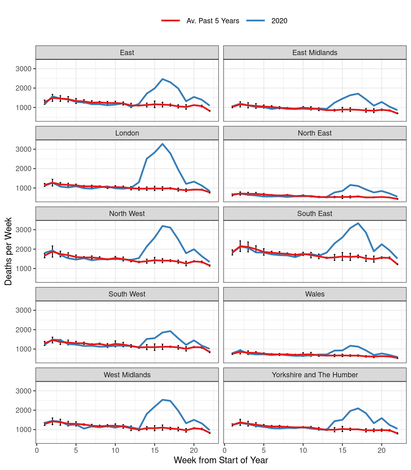
Figure 1: Total Weekly Deaths in England & Wales.
With the caveat that the date at which a death is reported need not agree with the date at which it actually occurred, excess deaths appear to have peaked and begun to decline in each of the ten regions. (Recently the ONS has started posting data on occurrences rather than reports, but these are unavailable for the historical comparison we’re making here.) As in my earlier post, the red curve is an equally-weighted average of reported weekly deaths in a given region for the past five years, up to and including 2019. Weeks are defined by the ONS to end on Fridays. This means that a given week does not necessarily correspond to the same days of the year across years, but always exactly one of each day of the week: Monday, Tuesday, etc. This eliminates seasonality from day-of-the-week effects, but creates the possibility of neglected seasonality from holidays that move across weeks during different years, e.g. Easter. For each point on the red curve, we have added simple error bars: \(\pm 2 \times \text{SE}\) where SE is the usual standard error for a mean, ignoring any possible dependence between deaths in the same week across different years. The blue curve depicts weekly deaths in 2020.
We had hoped to include data from Scotland in this update, but it turns out that the NRS, Scotland’s equivalent of the ONS uses a different definition of weeks of the year, so it wouldn’t be easy to line up the respective series for purposes of comparison. We may revisit this later on.
If you’d like to replicate our plots, the R code is as follows:
library(tidyverse)
library(rcovidUK)

#Set the most recent week of data for 2020
week_2020 <- ONSweekly %>%
  filter(year == 2020, reg_nm == "North East", !is.na(deaths)) %>%
  pull(week) %>%
  max

df_2020 <- ONSweekly %>%
  filter(year == 2020)

df_prev5 <- ONSweekly %>%
  filter(year < 2020 & year >= 2015) # Use last 5 years for average


df_prev5 %>%
  group_by(reg_nm, week) %>%
  summarise(deaths_mean = mean(deaths),
            deaths_sd = sd(deaths),
            n = n(),
            se = deaths_sd/sqrt(n)) %>%
  mutate(year = "2015-2019") %>%
  rename(deaths = deaths_mean) %>%
  bind_rows(df_2020) %>%
  filter(week<=week_2020) %>%
  ggplot(aes(x=week, y = deaths, col = year, group = reg_id)) +
  geom_errorbar(aes(ymin=deaths - 2 * se, ymax=deaths + 2 * se), width=.2, colour="black")+
  geom_line(size = 1) +
  facet_wrap(~reg_nm, ncol = 2) +
  scale_color_brewer(palette = "Set1",
                     labels = c("Av. Past 5 Years", "2020")) +
  labs(x= "Week from Start of Year",
       y = "Deaths per Week") +
  theme_bw()+
  theme(legend.position = 'top',
        legend.title = element_blank(),
        legend.key.size = unit(1, "cm"))